November 28, 2006
It's A Weird World...
I took the three requested square paintings to Atlanta today, they seemed pleased, but it was the last minute, slap-dash landscape that they exclaimed over... man! Okay... I'm just going to have to set aside some time and devote the studio to some serious landscape development and production. Since they continue to call for these (the bigger the better) I might as well give them something I'm not timid to call my own. I've piddled around with various formats and styles over the years, sometimes hitting on some pretty good efforts, but there's not a one of the recent works that I'd want to hold on to for myself. "Good riddance" is not a proud feeling.
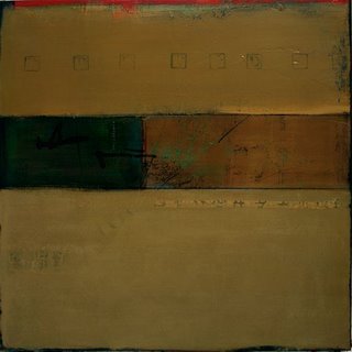
On the other hand, they returned two paintings that surprised me... both are prime, IMHO! I'm not really surprised that the above painting was returned, probably borders on too minimal and the color is strange. I'm strongly considering tagging it as a personal collection piece. I love it! The other returnee will fit right into the Memphis May show... I may dock it in another gallery temporarily, or just enjoy it at home for a few months. Seems they had too many red paintings. Go figure... I guess red isn't as big this year. This particular painting is the fourth in a series, of which the first three sold readily at a different gallery. No matter. It's much richer than the photo link shows... both paintings are. I take lousy photos of my work, but I don't sell on line so it doesn't really matter.
J goes in for cataract removal in the first eye tomorrow... I'm upset because his ripened faster than mine, which are still a couple of years off. Man! I can hardly wait to ditch these glasses! Lucky dog!
Subscribe to:
Post Comments (Atom)


8 comments:
Interesting on what sells and what doesn't - or for that matter, what folks like. I'm with you on the dark painting - my kind of colors all the way. Rich and dark and earthy. The red, as well - just great.
Got a picture of the landscape they did like? Interesting for comparison.
It never ceases to amaze me how differently people view paintings. I think both of the pieces you show are wonderful. And I would be interested in seeing the landscape as well.
Also, just wondering-if you don't take the good photos does the gallery take pictures of the work for their sites, etc? Or do you send it off to a professional photographer?
I'll put a link to the landscape when it comes out of the camera. My photos (when I take the time) are nearly as good as a pros, but seldom can a camera really capture the full essence of a painting. I often get a bit of a jolt when I see work I've only known via digitals for several months. I'd rather a gallery use my images than theirs which are often crooked or faded, way worse than mine. I only use professional photos when invites are involved.
I love that dark moody painting, but can see why it didn't sell, although I have no idea (wish I did) what will sell and what won't. Not surprised that your landscapes are always winners.
Love that yummy red one, of course, and the dark one as well. I know from seeing many of yours up close and personal how a picture can't do them justice, no matter how professionally done.
I love this dark one. Those are definitely colors more to my liking than bright clear colors.
I can't believe they returned this painting, it is a winner in my IMHO because of its subdued elegant nature. I have been following your work for about four years and all is incredibly inspiring.
Post a Comment